
The Keaton
The Keaton
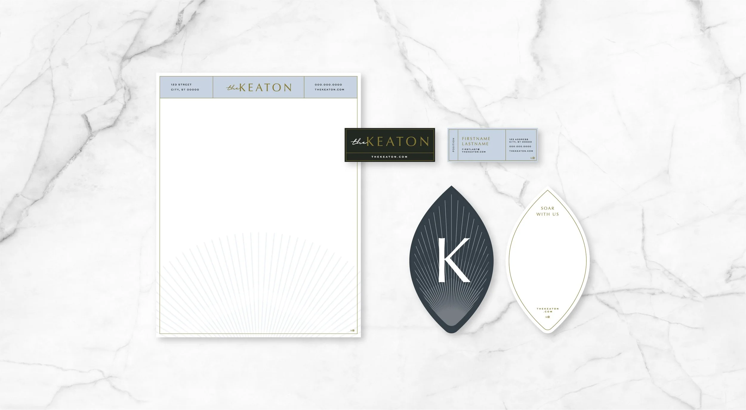
The Keaton name, rooted in an Old English term meaning “place of hawks,” symbolizes a swift, intentional lifestyle reflected in every detail of its branding. From the stylish, classic marketing system—featuring business cards, letterheads, note cards, and envelopes—to the thoughtfully designed rack card with die cuts and gold foil accents, every element mirrors the community’s meticulous nature. The website further enhances this identity with a harmonious blend of structured layout and ethereal ambiance, featuring subtle animations and refined photography that invite users to explore and engage more deeply.
scope of work
Brand Identity
Print Design
Website Design + UI Design
Email Marketing


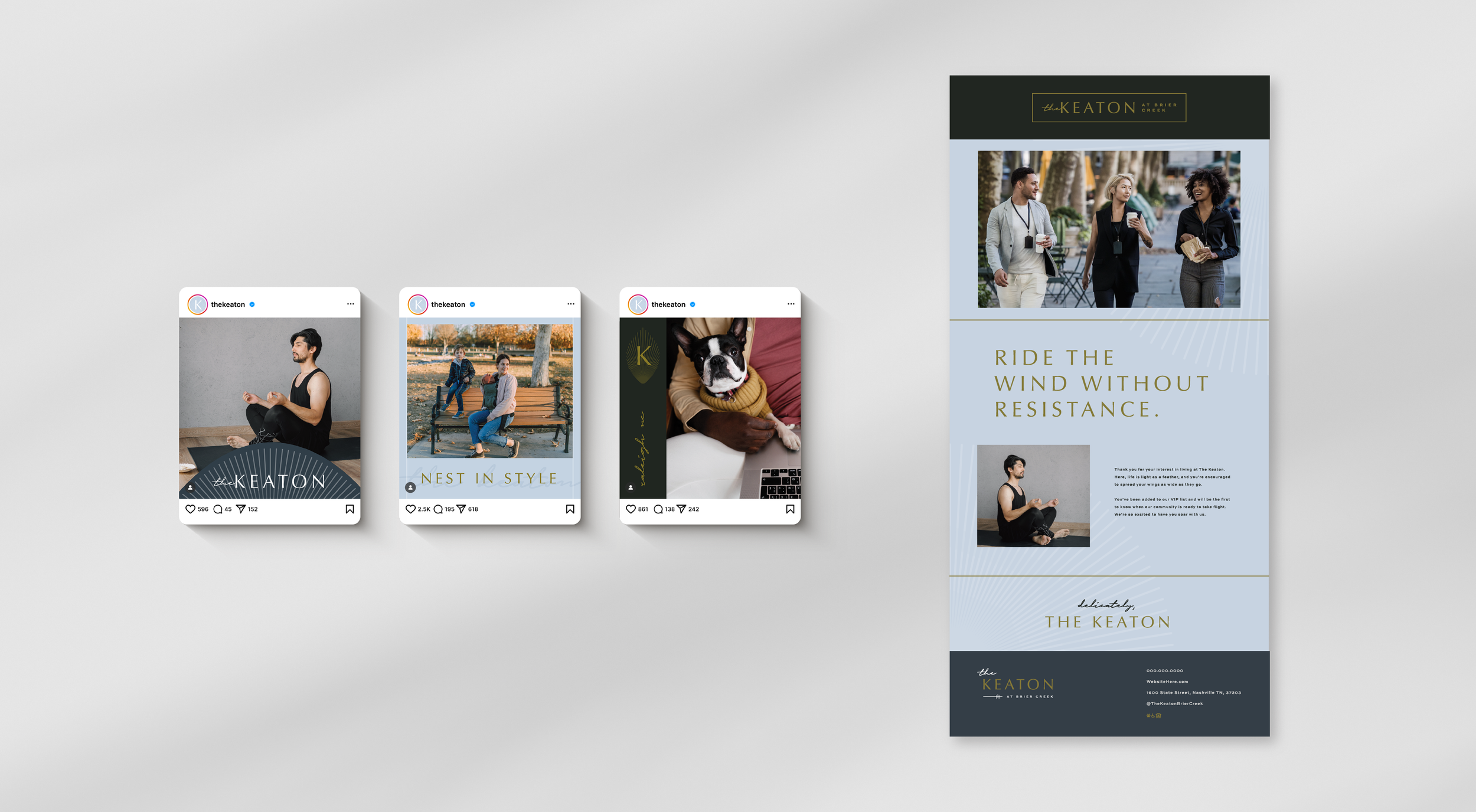


The robust website masterfully harmonizes a well-defined structure with an ethereal ambiance, resulting in an enticing and welcoming user experience.
Its captivating features include subtle animations and polished photography, designed to allure visitors and inspire them to delve deeper into its offerings.